Landing pages, web pages and microsites
Begin with the mobile layout first.
Promo website for the novel "The Class of '65: A Student, a Divided Town, and the Long Road to Forgiveness" by Jim Auchmutey
Layout made in Photoshop and XD, built and published using a custom SquareSpace template
My friend Tina is a highly sought after designer and I've had the good fortune of being her go-to when she’s overbooked, which is how I lucked into building this book and tour promo site for Jim Auchmutey's non-fiction novel.
TruGreen
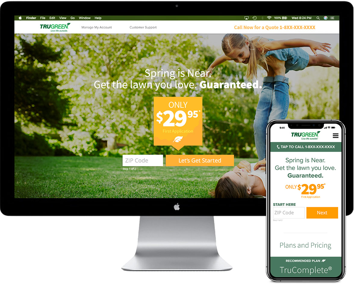
© "Live Life Outside" PPC campaign landing page
Layout made in Sketch and InVision, built and published in Ion Interactive (Liveball)
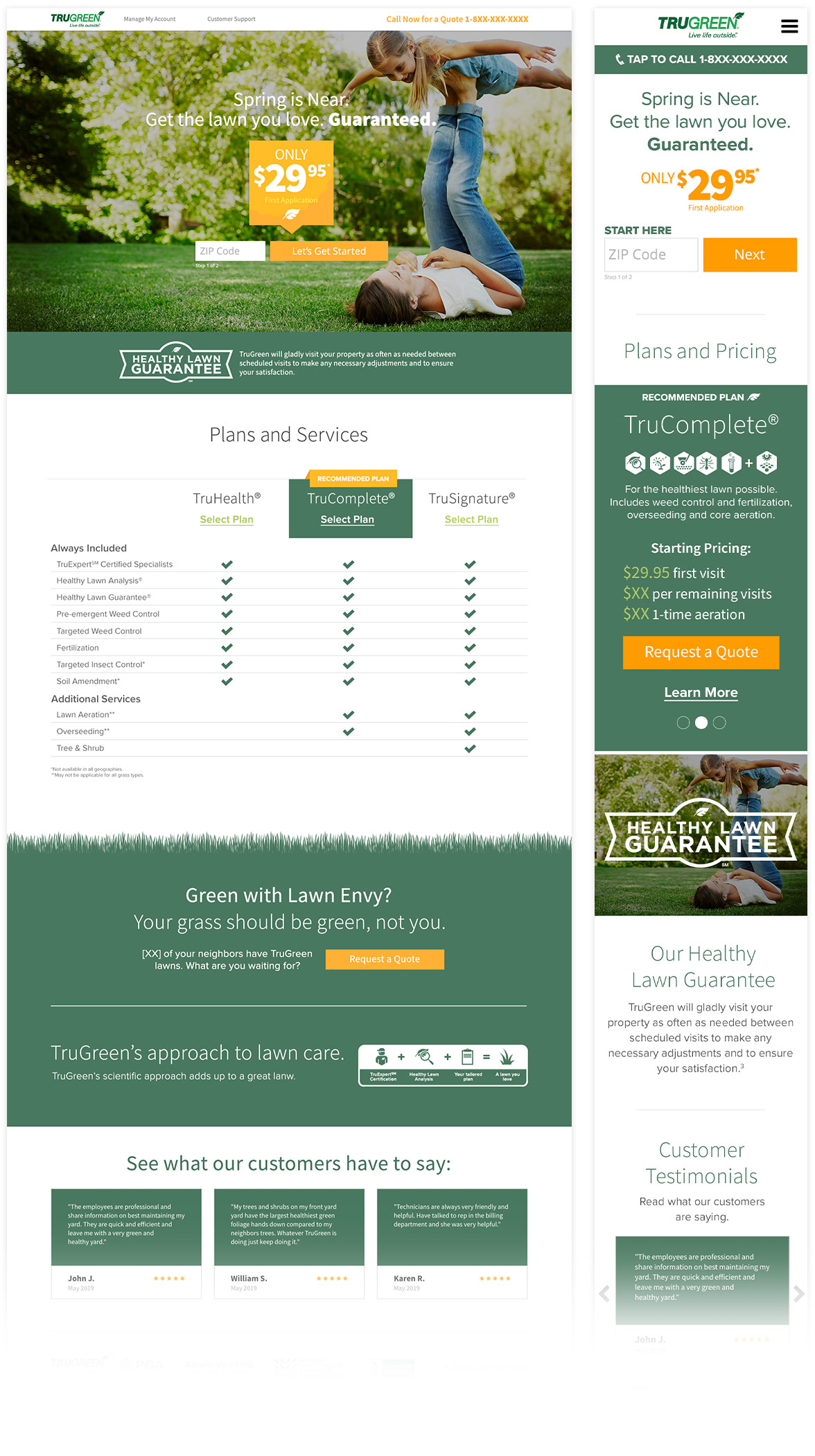
The page loads showing just a zip code form, which lives in a two‐page slider, hiding the second step form fields(1) which will ask for the user's name, address, phone and email.
Placing the form in a slider also eliminated the need for a page reload upon the user entering their zip code and going to the next step.
The Golden Circle
All of my TruGreen layouts were built upon Simon Sinek's Golden Circle theory (Why > How > What), which emphasizes giving hierarchy to the question of Why.
In the case of TruGreen, to "Get the lawn you love" was the "Why" (given greatest hierarchy).
The "What" (lawn care tailored to your specific needs) and the "How"(by providing essential nutrients, protection, organic soil amendments, etc.) are presented as secondary.
During my time as a UX designer at Full Cup Creative, TruGreen saw an average of over 40% lift year over year in converted PPC traffic.
(1) Legacy (Clicktale) heatmap and screen recording data showed that presenting the leadform incrementally greatly reduced dropoff, especially for Shopper and Researcher personas.
American Home Shield
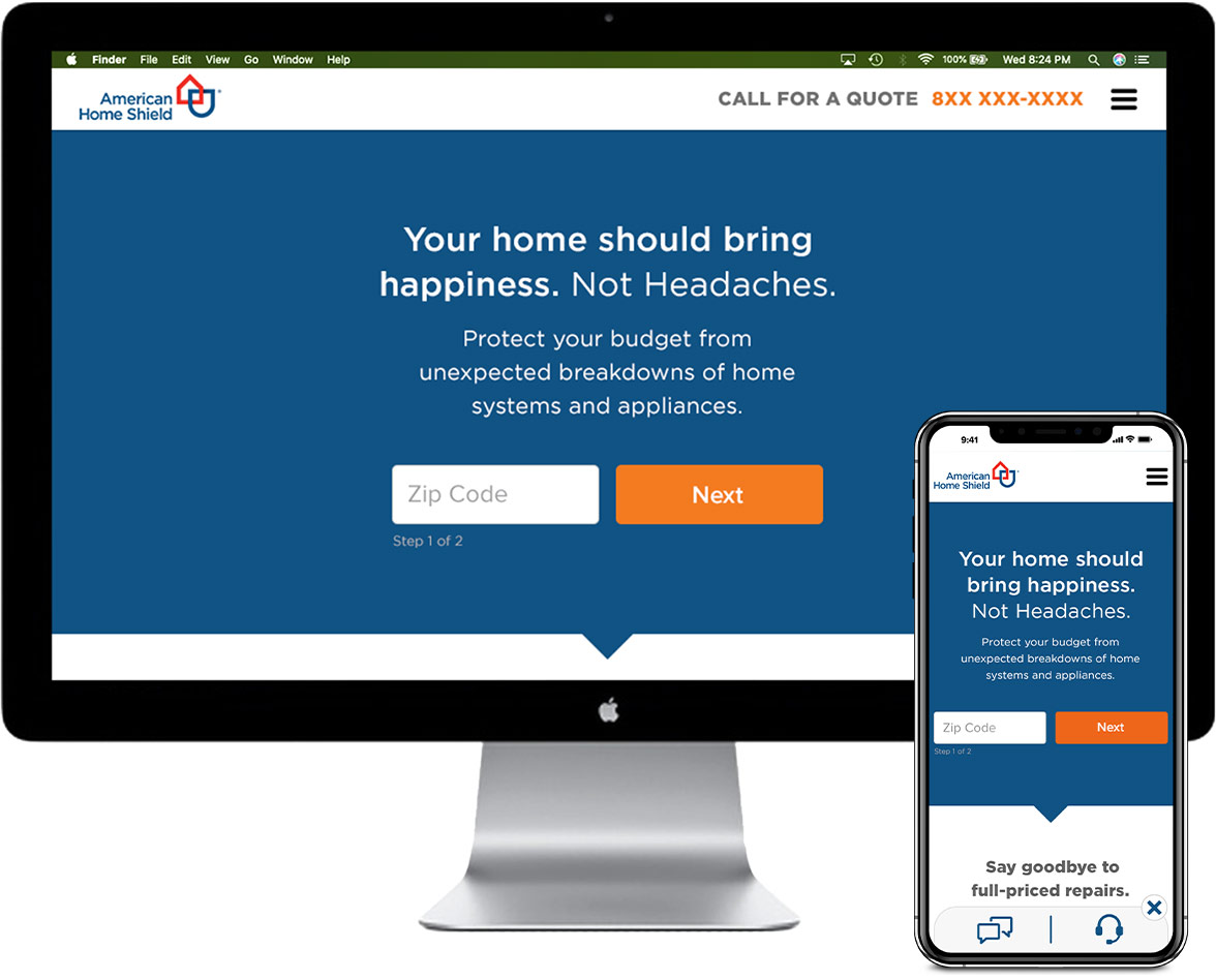
© "Protect Your Budget" Summer 2018 PPC campaign landing page
Layout made in Sketch and InVision, built and published in Ion Interactive (Liveball)
AHS utilized a dozen or more tracking pixels and scripts for their PPC pages which could have the impact of negatively affecting load times.
Even by 2018, long before our developers had worked with AHS’s marketing team to implement loading all the pixels at the same time and after page load (and to remove any pixels and scripts that were accumulating duplicate data), my mission had always been to create the most lightweight, fast-loading pages possible, using minimal assets while not compromising essential information about the services they provided.
Much like TruGreen's PPC pages at that time (such as above), we'd often used lifestyle imagery in the featured section as testing had showed this practice converted more leads.
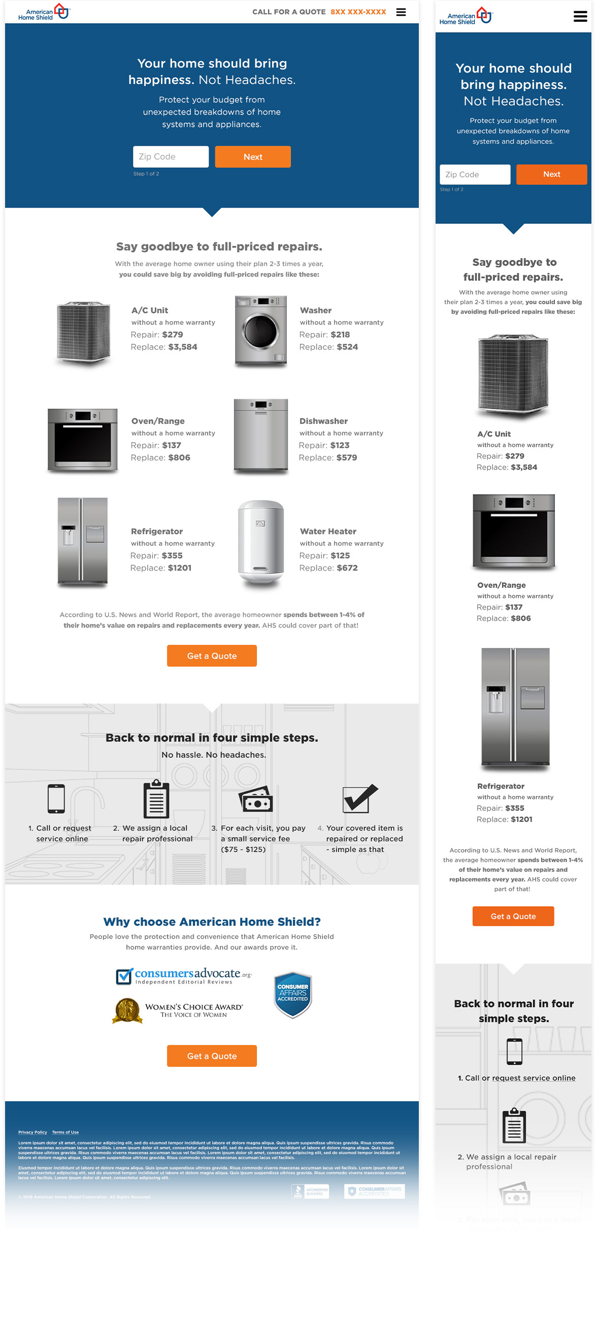
But given the high volume of American Home Shield's PPC traffic, which amounted to a million dollars or more in revenues per year for the company, we calculated a loss of about $75,000 for every second the site might fail to load. Thus, it was imperitive the UX not contribute to any potential slow page load times.
By using visual cues to draw the user's eyes to critical information down the page (and by analyzing scroll maps, hover maps and screen recordings to determine which sectons to give the most hierarchy to), we netted an average lift of over 30% year over year during my time there, simply by focusing our energies on an intuitive user experience.
Terminix
© "Save $50" 2019 PPC campaign microsite
Layout made in Sketch and InVision, built and published in Ion Interactive (Liveball)
The "Save $50" campaign came about after dozens of rounds of A/B testing. We tried "Save $100", "Save 15%", "Save 29%", "Save 30%" and many more offers, but it was "Save $50 on a Terminix Pest Control Plan" that beat them all.
In truth, it was the "Save $50" offer that dethroned the toughest page any of my creatives ever went up against—a page we internally referred to as Terminix’s "Big Green Monster" control page (this "Save $50" page is a few generations removed from it).
A Brief History
The Big Green Monster was similar to the "AHS Protection" creative above in that it had a pithy headline ("Stop Pests in their Tracks and Save") and a zip code form (1-of-2 steps) below it, all located in the center-middle of the page with a solid color background (guess what color).
It had reigned supreme for 2 seasons, winning every A/B test we'd ever thrown at it.
But it was the "Save $50" offer that would prove to be its undoing.
In any true A/B test only one variant should differ from the control page(2) (a different CTA, different headline, different featured image, different offer, etc per round of testing). So when we tested against the Green Monster we only changed either the headline or CTA (as those were the only two elements the page contained). But what ultimately won was making the headline itself into an offer (i.e., changing "Stop Pests in their Tracks and Save" to "Save $50 on a Terminix Pest Control Plan").
The Green Monster already had a conversion rate of over 18% (almost unheard of in the CRO game). But the changing of this one element increased conversions to a whopping 21% (closer to 22 percent, in fact).
From there, via many more rounds of A/B and multivariate testing, the "Save $50" page evolved into what is seen above.
You may not know to look at it but a lot of patience, data analyzation, outright incredulity and many, many minutes of team meetings went into making it the success it was.
(2) For a more thorough explainer on A/B and multivariate testing, see the blog post I wrote on the subject here during my time at Clicks and Clients.
Improv
© Defensive Driving course registration page
Layout made in Sketch, built and published on WordPress platform
I've often found what helps a page is the simple removal of unneeded clutter: non-critical elements on a page that are given too much hierarchy, non-collapsed navigation menus, social media and sign-up links that divert users from the conversion path, etc.
Often a simple shuffling around of a few things (and removal of others, as was the case here) instantly yields the desired lift without having to scrap a site completely and start over.
Example:
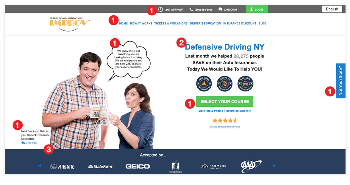
Below is a shortened version of a usability assessment I made for Improv regarding their old page (Image 1) along with a competitor page I designed based on that assessment (Image 2) to compete with it in a split-URL test.
Analysis:
 Too many distractions from the conversion point and too much clutter
 Headline too vague and non-authoritative
 Critical visual asset given too-low hierarchy
Image 1
![]()
New page included:
 Minimal imagery in lieu of a subtle graphic to draw the user's attention to the CTA (less distractions, more lightweight) as well as a more authoritative headline
 Greater hierarchy given to the insurance providers who accept the driving course certification and to the New York State DMV, Insurance, and Limousine Commission badges
 Bright orange buttons with a better call to action
Image 2
![]()
This page saw a 43% lift in completed signups the very next day (the control page had an average daily conversion rate of 16% and the variate page had a conversion rate of just below 23%)
Digital Wealth Alliance
© Bitcoin training registration page
Layout made in Photoshop and Figma, built and published on WordPress platform
This was the destination landing page for users who clicked on DWA's sign-up banners that would appear in their social media feeds. It was the first inception of the page for their (then) newly-launched Bitcoin education classes.
I'd never built a sign-up page for in-person classes at the time but luckily my employer, Clicks and Clients, had some existing clients who had been running successful social media marketing sign-up events that I could pick up some design cues from.
M•KAP
© server-error pages
Designed in Photoshop
When I was still a student with close to 2 years before graduating I interviewed with Mike Kaplan, owner and proprietor of M•KAP Hosting, where my main objective was to redesign his error pages, should I land the gig.
During the interview process he'd asked me to send over a few examples of how I might rethink them.
Having seen plenty of error pages, I went with what I knew, which was a pretty simple (boring), to-the-point design.
Mike didn't want that. In fact, after viewing my first round of ideas he said, "I want you to scare me."
Now, when I first interviewed with Mike I'd noticed at least two things: 1) he was good-humored and 2) had a very large Banksy print on his wall.
This led me to think of Shepard Fairey and eventually led me to Space Invader.
A-ha!
Long story long, sending him this comp is what got me hired.



 Too many distractions from the conversion point and too much clutter
 Headline too vague and non-authoritative
 Critical visual asset given too-low hierarchy
 Minimal imagery in lieu of a subtle graphic to draw the user's attention to the CTA (less distractions, more lightweight) as well as a more authoritative headline
 Greater hierarchy given to the insurance providers who accept the driving course certification and to the New York State DMV, Insurance, and Limousine Commission badges
 Bright orange buttons with a better call to action
