How I solve problems.
Below is a live prototype for a landing page (LP) I did while Creative Director at Clicks and Clients. The client, Underground Elephant©, is an auto insurance quote aggregation company.
Problem:
Previously their LP was an inefficient and outdated 15-pages-long form (see Fig. 1). Also, the branding and offer didn't match the first touch banner users had clicked to arrive at the LP.
It was easy to hypothesize these were the reasons the client was seeing so much dropoff.
Fig. 1

Solution:
1. Without matching offers, users were confused and/or dubious about the credibility of the service.
I addressed this by simply matching the offer claimed on the social media banner (Rates as low as $19/mo) with the offer displayed in the featured image at the top of the LP (the LPs' featured image had previously read "Rates as low as $9 a week"—a rate higher than the claimed social media banner offer of $19/mo users clicked to get there—an erosion of trust right from the first impression).
2. With no pagination or progress indicators, users had no idea how far along in the form they were nor how close they were to the end.
To remedy this I started by combining some of the original 15 pages and trimming the overall number of steps down to 6.
I then divided those 6 steps into 2 separate, numbered dropdown modules, embedding each within a slider that employed carousel dots letting users know where they were in the process.
3. Because the site was built with raw code (not on a drag-and-drop visual builder of some kind), any changes would need to employ minimal dev time and ideally use the same framework.
Being a front-end coder myself, I accomplished this by redesigning the page so their dev team could recycle 90% of the existing code.
The final result (Fig. 2) was a much more compact leadform that the client loved.
Fig. 2

Below (Fig. 3) is one of the final prototypes I sent them (built in XD).
Fig. 3
Assessments
When reviewing a page, site or section I typically go top to bottom and notate any issues that I believe may need addressing, and unless specifically requested I'll offer more than one approach (usually from most critical need to least), giving clients and/or account managers options on how far they want to go.
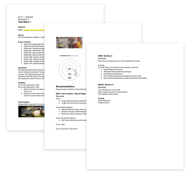
I'm also quick at coming up with assessments and detailed hypothesese, setting up tracking sheets focused on the specified data points, launching tests, keeping stakeholders apprised and supplying detailed reporting and analysis upon completion along with any recommended next steps (see Ex. 1).
Ex. 1
 Wireframing and Comps
In my experience working in an extremely fast-paced environment, wireframing is first most often done with my team on a dry-erase board and later redrawn in Cacoo or Balsamiq (see Ex. 2 and Ex. 3).
Ex. 2 (XS)

Ex. 3 (LG)

Going from concept to a fully-rendered prototypes or published content requires a lot of communication. In some shops I've had direct contact with stakeholders and others I've communicated with through account managers; but either way, communicating ideas clearly and concisely has often been 90% of any role I've had as a designer, and being quick to respond ensures I'm never what's holding up a project.
For what it's worth though, I've been reviewing, assessing, product managing and designing UX, UI, CRO, lead-gen, eCommerce, non-profit and corporate public-facing sites for the better part of the last decade, and my aim is to make the most of a client's time and capital.